
Part 4 – Résumé Design
When the hiring manager opens up a résumé file, the résumé’s design is what makes the first impression, the content only comes in later. Before scanning or reading the content, the hiring manager’s brain registers the layout and assesses how easy or difficult scanning it is going to be, how hard on the eyes the color scheme is, and whether they need to zoom in because the font is too small, or whether everything is where it should be and in appropriate sizes.
An unbalanced design is easy to identify, but a balanced design is hard to create. Luckily for the applicants, design templates make the job easier, and I strongly recommend using a résumé template for developers who lack the artistic flair required to make the hiring manager want to hire you when looking at the design alone.
Luckily for the candidates, thousands of design templates already exist that offer visually pleasing and easily scannable designs with zero effort. Whether you are relying on your own skills and designing your résumé from scratch, or you are using a template from the internet, there are aspects of the design that must be just right, to give your résumé the boost that it so desperately needs. We will take a look at only a few of them here.
Scannability
If there is one design goal that your résumé should focus on, it is scannability, and all other goals stem from it. Your résumé layout should let the hiring manager immediately identify which part of the résumé contains what section, in the first three seconds of looking at your résumé. It should read like a map, not like a maze. Simplicity is the key here, so instead of overloading your résumé with visual clutter that complicates it, aim for a layout that does its job, and its job is to provide the hiring manager will the required information about you so they can make a judgement of where to go with that information. If it doesn’t do its job well, the hiring manager would be frustrated at having to find the information they’re after, and that is not a good start to any relationship.
Whether you opt for a single-column résumé or choose two, or even three columns, make sure that the resulting document is easily scannable – and ‘easily’ is redundant here.
Human beings read and scan text in certain fixed patterns, resulting in some hot, high-attention zones and some blind spots. Research is available online for the interested, so we will not delve into that, but read and use that information if you have time, and you should have plenty of time if you are looking for a job.
Fancy fonts are not scannable, unnecessary graphics and icons are not scannable, capitalized headings are not scannable, tiny text is not scannable, neither are huge letters, and the list goes on and on. Use your common sense to assess all such elements and eliminate them from your résumé.
Attention to Detail
If you intend to join the software development industry, you would be joining a clan that frets over single-pixel alignment issues, has debates on the merits and demerits of having the opening curly brace on the same or the next line, and thinks about space vs. tab indentation and camelCase vs. TitleCase for a living.
All good software engineers have a trace (or bucketfuls) of OCD in them, and you need to fit in. Chances are that the person reviewing your résumé is at that position because of paying consistent attention to detail. He wants to hire an heir who is a natural fit, and possesses the talent to eventually replace the hiring manager so that the hiring manager can focus on those very important debates.
If your résumé does not demonstrate your capacity for attention to detail, another résumé that does would get preference over yours, sometimes even if it belongs to a less talented developer than you.
Take a magnifying glass and analyze your résumé wearing an OCD hat until you can find no room for improvement.
 |
| REJECT ED |
 |
| A pdf résumé that has clipped text is a rejected résumé. |
 |
| Some small errors hurt more than blatant, big ones. |
 |
| . |
Colors and Contrast
Your résumé palette could be anywhere on the spectrum from back and white, to gray-scale, to four color to 16M colors. Unless the template you chose already has a neat and aesthetically pleasing design in multiple colors, opt for simplicity and stick to gray-scale, because it is hard to do colors right, and also because if your résumé needs to be printed during some step in the job application, it is most likely not going to be on a color printer.
Your choice of colors should not make the résumé fonts hard or impossible to read, and it should not raise questions about your artistic abilities. Do read up on color theory if you want to add another skill to your résumé.
 |
| A camo-mail. |
 |
| My personal color preferences go against this choice. |
 |
| The palette was noticed before the third person text. |
Breathing Space
Whitespace is just as important as text. Your text needs room to breathe, or it will suffocate. In an attempt to cram all your information on a single page, you will hurt your résumé if you reduce the font size, line spacing, margins or kerning. There is nothing more visually displeasing than a résumé with hundreds of technical abbreviations and no whitespace between them.
Let your résumé breathe and it will grow and thrive.
 |
| Too much information compressed in a tiny space. |
 |
| Another glossary attempting to save trees. |
 |
| The words fighting for whitespace. |
Fonts
Each font has its own personality, and ‘fun’, ‘exotic’ and ‘quirky’ fonts do not belong in a résumé. Choosing the wrong font is an indicator of your weak comparison and selection skills, and that is why the hiring manager has the authority and the motivation to reject your résumé early if he doesn’t like the font(s) that you have chosen.
Stick to professional, sleek and matter-of-fact fonts and avoid complicated, hard-to-read and embellished ones that want the reader to stare at their beauty instead of the résumé content. The corollaries around font sizes and emphasis are obvious, so you can figure them out yourself. If your template does not come with its own fonts, find a pair of fonts that work well together, so you can use one for headings and another one for content. Get critique on your font choices from other people, and make adjustments as necessary.
Spend more time on your résumé content than your font selection. Great content in a common font like Arial is much better than one with poor grammar and spelling mistakes in a beautiful font.
    |
| Bad font selection at work. |
   |
| Fun fonts give a childish personality to your résumé. |
 |
| Monospace fonts can work well when used correctly, but that is not the case here. |
 |
| This practical font pair is a sight for sore eyes after looking at the fonts above. |
Underlining
Underlining is a vestigial tool from the days of typewriters, when underlining was the only option when you wanted to emphasize important text. In present times, you have italics and bold, along with subtle font changes, to make parts of text more prominent, so use these modern devices and avoid underlining any text on your résumé.
Hyperlinks are an exception in certain scenarios, as they are expected to be underlined.
  |
| Underlined text offers nothing that bold text does not. |
Logos
Even if you are an expert in twenty technologies, do not dump their logos on your résumé. The hiring manager knows what the HTML5 logo looks like, and the candidates who wrote ‘HTML5’ instead of pasting the logo probably know HTML5 well too. The ATS, on the other hand, does not parse images (yet), and that poses a serious disadvantage for your résumé. The twenty logos also need many times as much space as their text counterparts, and space is at a premium on your résumé, so use it wisely.
 |
| Table |
Watermarks
I see absolutely no reason why a résumé should have a watermark, but I’ve seen a few ‘BS’ résumés. Maybe it is a template that people keep reusing, just don’t use watermarks. Please.
 |
| An actual watermarked résumé. |
Number of Pages
The number of pages is probably the most debated topic when it comes to résumés. My take on this is simple, if you have an engaging three page résumé, hiring managers will invest the time in reading all details. If you have a single page messed-up résumé, it would be immediately discarded. The expected number of pages is usually directly proportional to the length of your experience, but there’s no upper limit for a zero experience candidate as such.
 |
| This résumé managed to fit a lot of text into a single page, at the expense of scannability. |
 |
| Starting with Page 0 is one way of staying within a single page ‘limit’ |
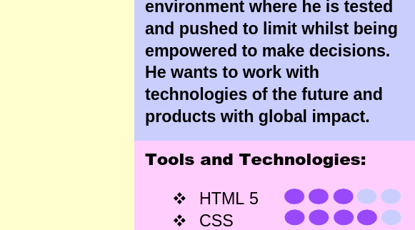
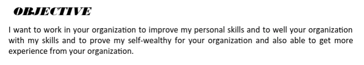
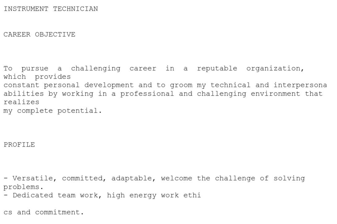
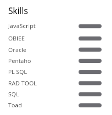
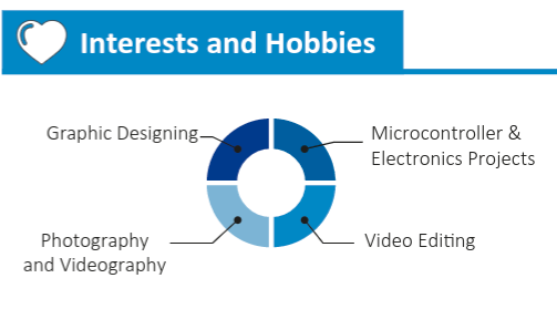
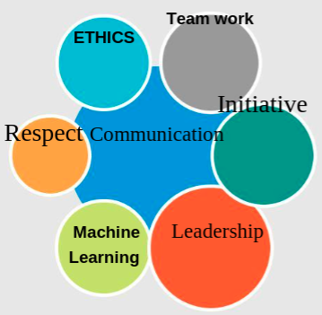
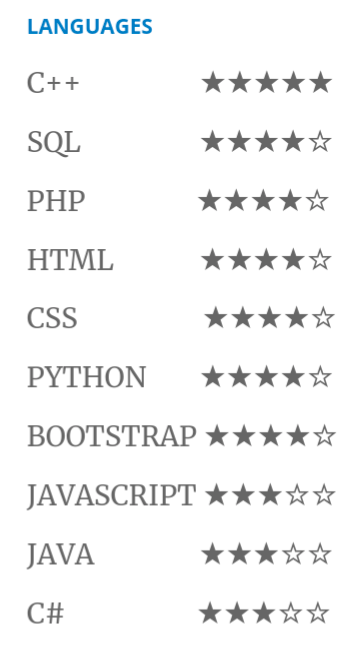
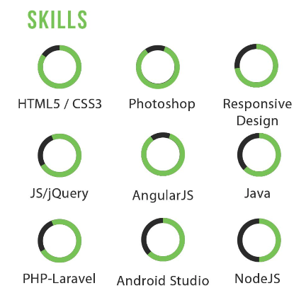
Charts and Infographics
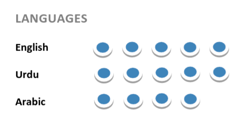
A picture may be worth a thousand words, and a neat data visualization in Tableau might look cool to you, but a skill chart just tells the recruiter about your charting skills. Self-ranking on arbitrary graphical scales beg for criticism, and in my opinion, should be avoided. Do us all a favor and just use words.
‘A thorough grasp of SQL, ‘Familiar with Java’, ‘Dabbled in PHP’ work better for people like me, and saves a lot of precious résumé real estate as a bonus. Your idea of a 70% C# knowledge is definitely different from mine, let the interviewer assess that during the interview. Read some Tufte to gain insights into information visualization.
 |
| Some of these skills ate power pallets, but a few bumped into ghosts. |
 |
| Does a 70% MySQL knowledge mean one knows SELECT, INSERT and UPDATE but not JOIN? |
 |
| Is that a 100% or 7%? |
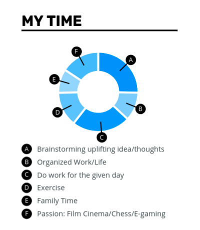 |
| G – Creating donut charts that don’t add any value to my résumé. |
 |
| If only everyone had the discipline to divide their time equally between tasks. |
 |
| I’m afraid 16/20 sticks in Javascript is a bit too low. |
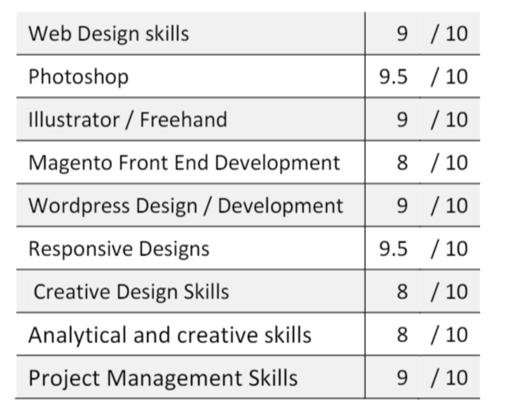 |
| A self-contradictory Design Skills table. |
 |
| Graphics for the sake of graphics again. |
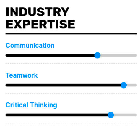 |
| Sliders are meant to be interacted with, not used as a graph, in my world. |
 |
| Another example of pointless visualizations. |
 |
| ALIGNMENT SKILLS: ☆☆☆☆☆ |
 |
| Is that 12% HTML5 or 88%? |
  |
| These charts would have made a little more sense if the bars were sorted. |
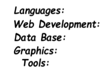
Nested Grids
The information on your résumé should be organized under sections and headings with a semi-flat hierarchy. A nested grid just wastes precious space and is very confusing to the reader.
 |
| Nested Grids do not belong on a résumé. |
Blank Pages
Many résumés that I encounter have a final blank page, which used to make no sense to me, until I saw a résumé saying ‘Page left blank for comments’. Thank you, dear candidate, for showing me the light. The résumé was in pdf format, though, and I had no intentions of editing the pdf to leave comments, so I didn’t.
Even worse are résumés that have a dangling last line or two on the last page. If your résumé content gets you in that situation, either compress your text so that the line is moved to the previous page, or use the opportunity to add give your content more breathing room so the last line is not left alone.
| This blank page was as useless as this image. |
| The page that unraveled the mystery behind blank pages for me. |
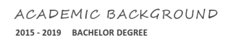
Common Templates
Some universities have a résumé template or a résumé creator system that they share with each batch of students that is about to graduate. Most of the students use that template without second thought. After all, it looks nice, has their university’s name and logo in the header or footer, and they don’t need to go through the trouble of finding a template for their résumé. If that works for you, then use it.
Do realize, however, that the hiring manager in a well-known firm ends up receiving résumés from most of the students in your local universities’ recently graduated batch. Such templates accumulates their own personality and stereotype. As the recruiter receives more and more résumés based on a particular template, a mental model of a typical graduate of that university gradually builds up in the recruiter’s mind. If you are OK with being pigeon-holed due to using the university’s template, and with the fact that your résumé would be one among many similar résumés, that is your call. If you want your résumé to stand out, you should strive to make it stand out in every aspect, including the template, so instead of being part of the graduating herd of your classmates, you should consider using a unique design or template that is not shared by your classmates.
Similarly, the most popular job portals allow you to download a formatted version of your résumé when you upload your data on those websites. If you use a résumé that was created through this mechanism, at least make sure that it does not contain the website’s logo or URL, for obvious reasons.
This Bullet
 |
| One last thing – please don’t use this bullet. It is very irritating. |